BBC SOUNDS
Re-usable Promo Component
Brief
How might we present single items to users in a compelling and useful way?
Challenge
Build a component which can be used to showcase our highest marketing priority content, encompassing music and sport events like Glastonbury, Euro 2020 and Big Weekend.
From research we highlighted that users felt the content presented to them on Sounds wasn’t relevant and they sometimes found it difficult to find what they were looking for.
The component should provide a single succinct message that matches up to what audiences might have been exposed to from various forms of marketing, helping users affirm that, ‘yes, I’ve come to the right place’.
Unfortunately the kick off of this project coincided with the beginning of lockdown and therefore all the big events this component was supposed to showcase were cancelled.
I was tasked with continuing design exploration whilst creating a proposition on how the component could be used in the ‘new world’. This was the first project in lockdown. I was responsible for developing new ways of communicating and sharing, ensuring collaboration across all platforms and disciplines involved in the project.
Solution
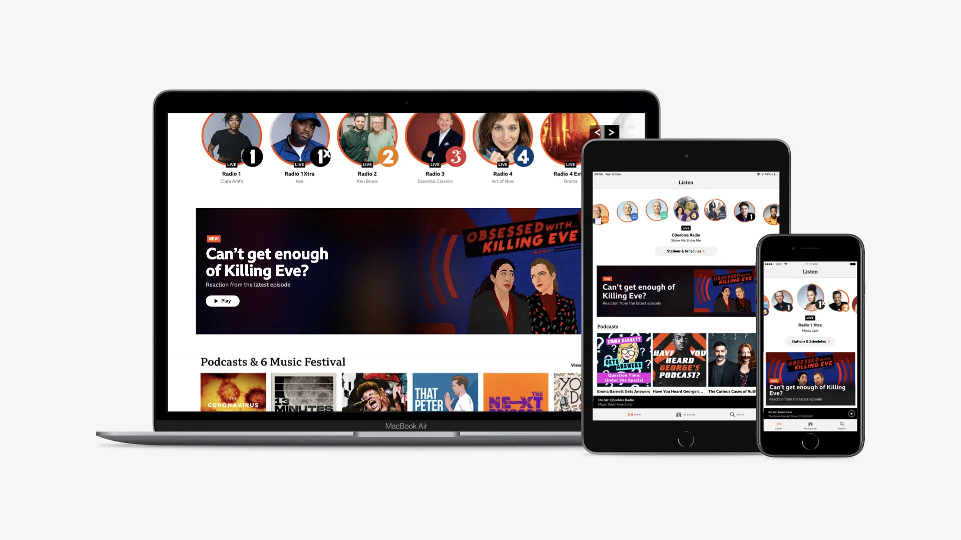
As a cross platform team we delivered a ‘white label’ component that could flex to promote the range of content Sounds has to offer. This allowed our editorial team to promote content using a single succinct and bespoke message on product, ensuring the most prominent content is relevant, easy to find and visually appealing to users.
My Role
I proposed a component which would give editorial the ability to apply bespoke metadata and imagery for each promo - meaning they could leverage the key aspect of the content being promoted. I also made the case that it should cater for content further than live - adding series and episodes.
This project was the first in which we were trialling a ‘quad’ system. This meant a lead was assigned from each discipline (Product, Project, Engineering and UX). The quad would meet weekly to discuss progress and ensure we were on track.
As lead on UX, I oversaw the process from conception to release. It was my responsibility to complete designs for all platforms and communicate these with the core quad and extended teams across each platform. As part of my role I had to connect and facilitate conversations between the various teams and disciplines involved.
As a starting point I caught up with both product and engineering representatives from each platform, identifying the limitations of each and laying out some initial requirements.
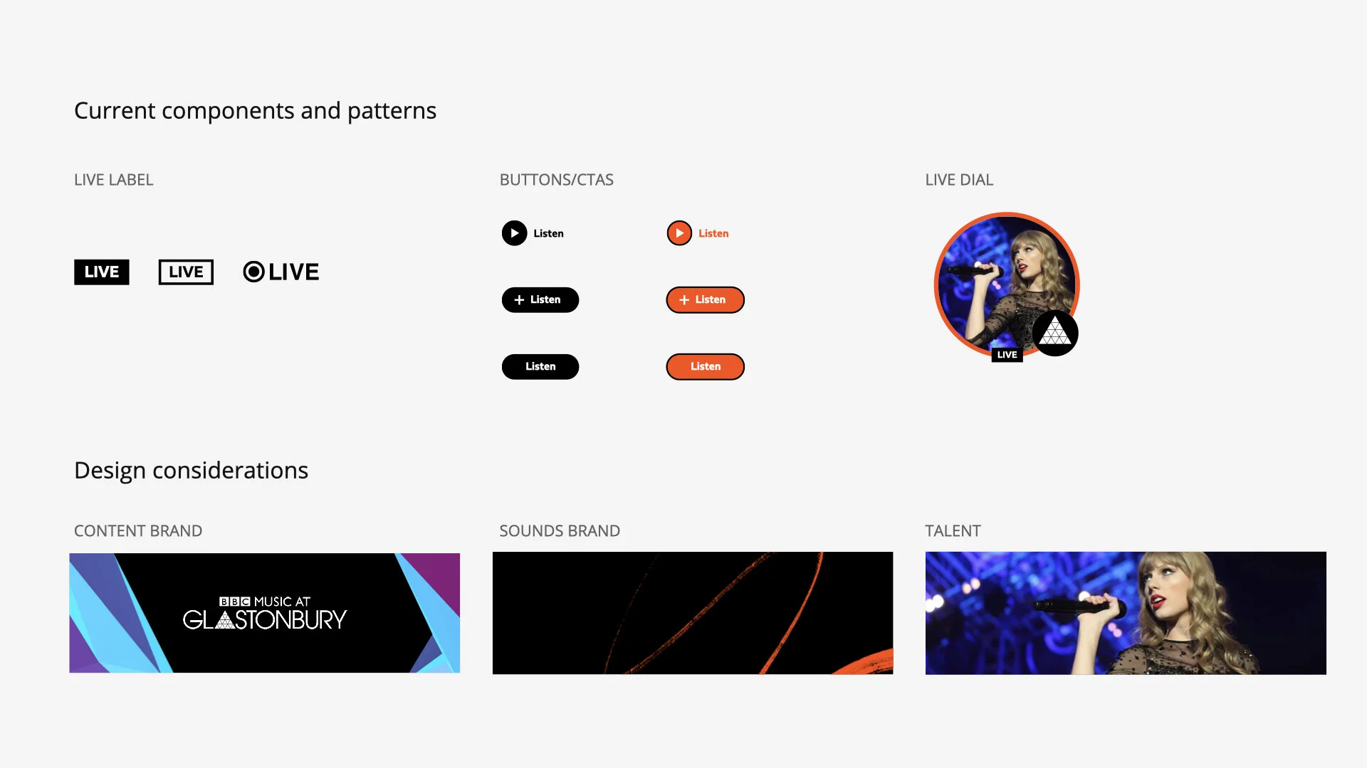
To begin the design exploration, I laid out the various design assets we could use in the component. This included the key metadata, visual assets such as the Sounds brand and content brand. This was shared at an initial crit with the Sounds UX team.
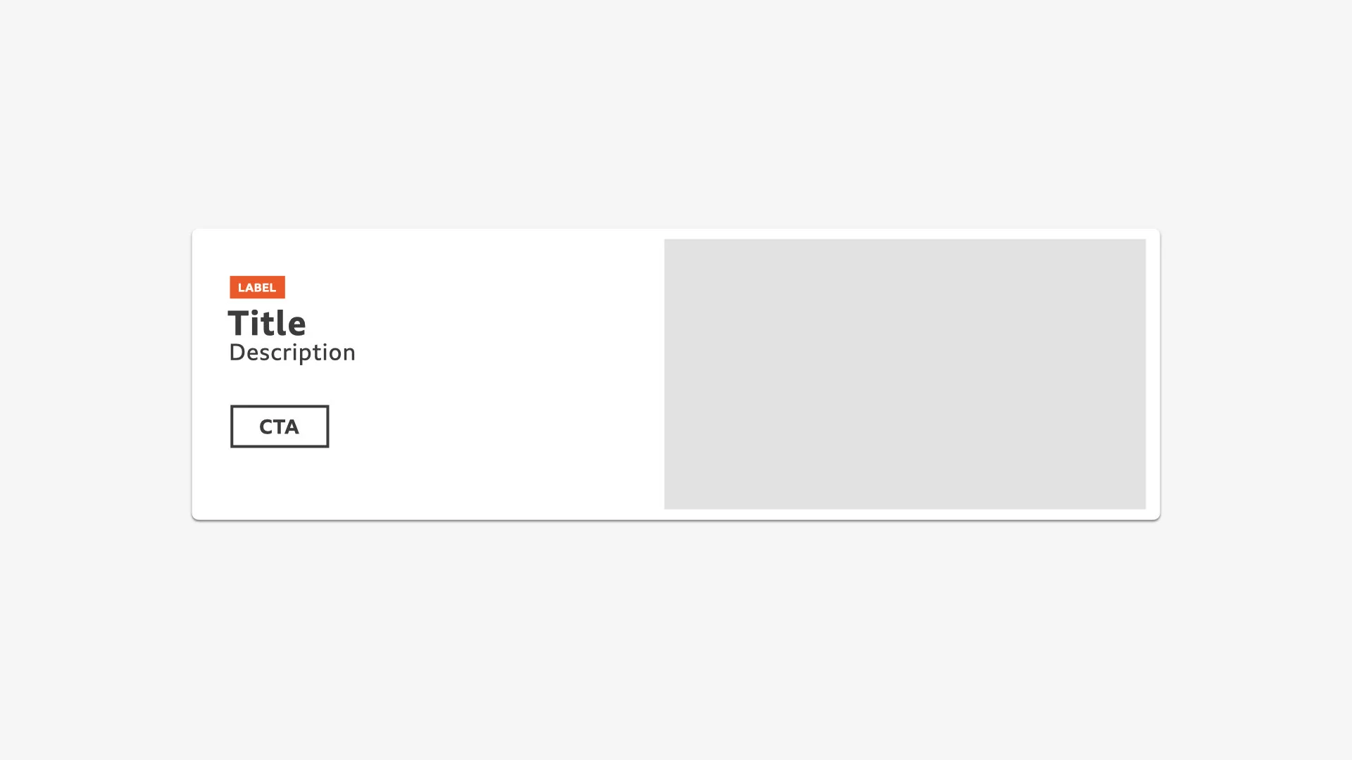
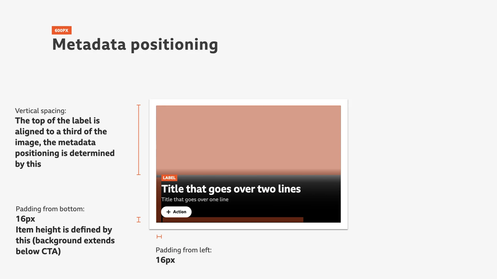
The component design included a label that highlights ‘why the content is being promoted’, title, description and key image. The image is repeated blurred and in low opacity in the background. This provided depth, rather than having a solid colour background.
During the design process I regularly caught up with engineering representatives from each platform to ensure what I was proposing was technically possible.
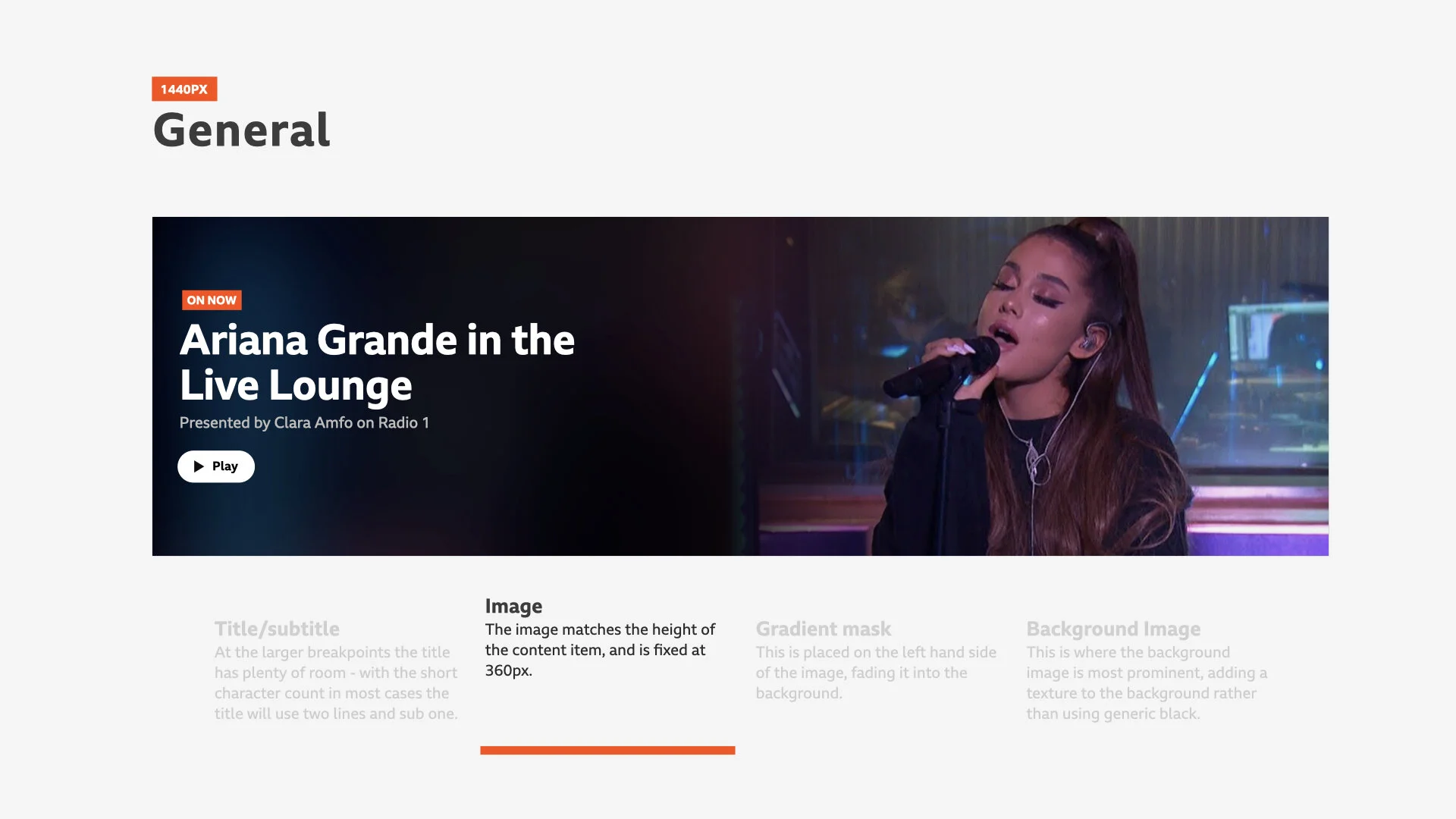
When this was done I pulled the exploration together into a presentation which summarised both the proposition around the component, the anatomy and finally showcased some ways in which it could be used.
I presented the proposition to product executives from each platform and editorial. This gained sign off and allowed us to move into the build phase.
During build I managed another designer to help deliver the component. I was responsible for continuing conversations at a high level and bringing any issues to the quad, whilst also overseeing build on web. The other designer would work with the engineers on the app version, ensuring quality and working with me to address any issues.
Throughout my time in Sounds I have explored different ways to provide documentation around designs. I believe Zeplin is great, but you miss out on reasoning, logic and why decisions were made. In my specs I aim to include this, meaning any discipline can pick it up, now or in the future and gain a full understanding of the work.
For this I worked with the lead engineer on web to create a keynote which partnered design decisions, adding extra context and animations to ensure clarity on handover.
During build I paired with engineers on web on a daily basis, focusing on crafting the component to ensure a premium and high gloss end result.
Partnered with this, I created a photoshop template for editorial, which easily allowed them to preview their chosen images and text across in the promo on each product.
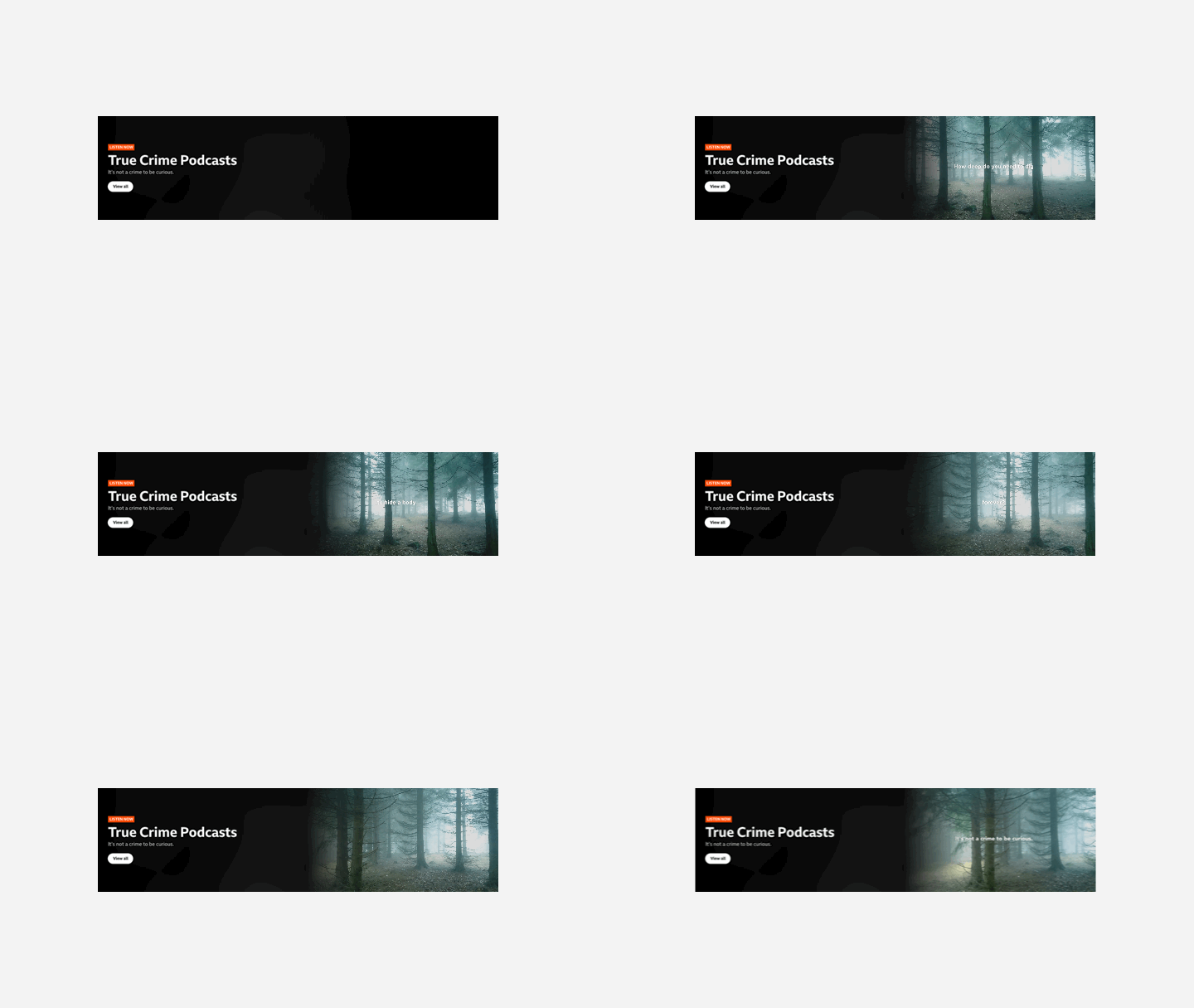
As a final delivery I created a vision piece which communicated the current functionality of the promo, how far we can push it and how we could iterate in future to add additional value. This included the ability to promote further content types, collections, introducing video/GIFs, and how we could make it more visually appealing through further brand assets.
Summary
The component has been used to showcase breaking news, live performances on radio stations and new series releases. When live events return it can flex to reflect these marketing priorities.
When looking at the initial stats we saw that a larger % of clicks came from non-weekly and 16-34s compared to most of the other rows, whilst it didn’t cause any disruption to the clicks on our current journeys.
This suggests that the promo is successfully drawing our target users in, with the best results coming from live content promotions.
This project gave me the chance to work cross-platform and lead on all aspects of design and build. Pushing the scope at the beginning to go beyond live was a huge change to the initial proposition being persistent with this ensured a far more flexible end result.
I would highlight the collaboration with our editorial colleagues as an area of improvement. They were included in shares. These felt more like sign-off rather than gathering their opinions and contributing to the design process. If a representative was included in the quad and present throughout the project, their expertise could have guided the process and provided a different viewpoint, and in the end a better component.
Collaborating cross discipline
Overseeing a project from design to build
UI design
UX design
Designing for multiple platforms
Working in agile
Stakeholder management
Leading
Working within brand
