BBC SOUNDS
Stations & Schedules
Brief
How can we improve user journeys to schedules on web?
Challenge
Currently our radio schedules are hosted on an external part of the BBC website. Our task was to rebuild these pages within the Sounds architecture. This gave us a chance to make improvements to each page and access the journey to schedules as a whole.
Whilst designing the new pages we had to keep in mind that our users (who skew older for these features) have built a well developed understanding of the current pages structure and patterns, having retained the same design for years. It was therefore important that we retain aspects of the current design, keeping it familiar enough to not disable our users with the re-design.
In addition to this the API which delivers the data for each page on the journey had already been defined and created. This meant that all exploration work would have to use this API as a core consideration, with us unable to make any changes without a strong use-case.
Solution
As a team we re-designed the stations and schedules journey on Sounds web. The result was a condensed and simplified journey which makes it easier for users to find and move between schedules. This also brought the experience inline with our current brand offering to provide a more unified and consistent journey for users.
My Role
For the initial stage, I managed a design trainee who worked on Sounds at the time. Together we conducted a SWOT analysis of the current journey, picking out potential pain points and areas which we could iterate to improve the experience. We partnered this with a competitor analysis around the stations and schedules journey provided by other services.
This image shows the current journey. You can walkthrough online here. (Follow the station or schedule link)
I took this information and formed it into a workshop to complete with the products and project managers and engineers involved in the project. This was just after lockdown and the first workshop I had conducted remotely. For this I used Figma. I asked the team to add visual sticky notes with ideas, pain-points and any other thoughts.
This project was heavily structured on an API which had already been created. This meant that all ideation was guided by this and the lead engineer on the project. As part of the workshop we analysed the API and explored if there was any additional data that could provide a better experience for our users. These were noted as iterations that could follow after initial release.
Including our engineers in this workshop allowed each idea to be sense checked before we got started on any discovery.
In the workshop we ideated around three key areas - the overall journey, the stations & schedules index page and the schedule pattern itself. I took the ideas generated and created some initial designs.
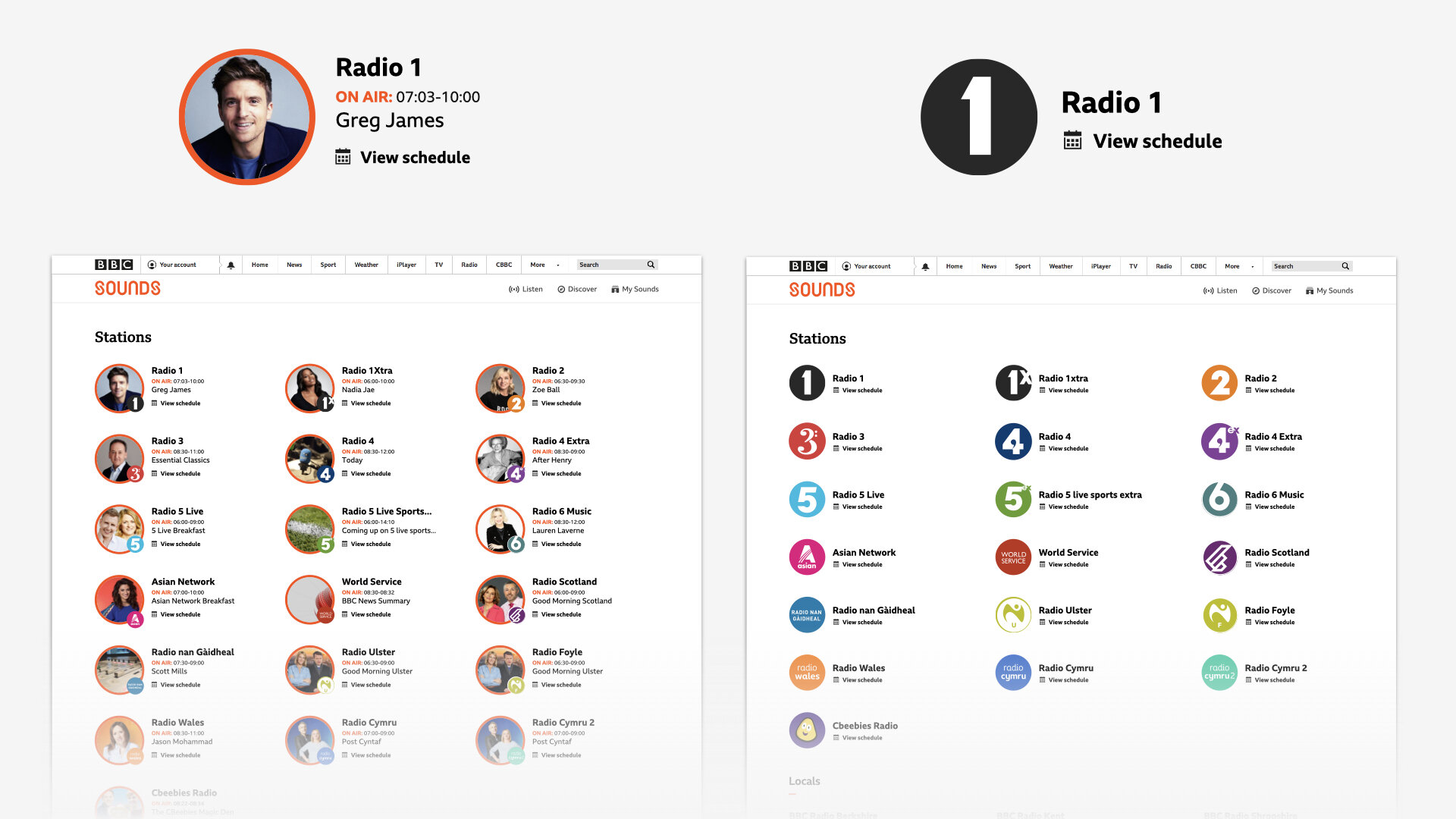
We decided the current split journey wasn’t needed and one page could meet our users needs. I explored how we could present each station, comparing a talent lead design which leveraged the users familiarity with our presenters and shows with an approach which used the station brand itself.
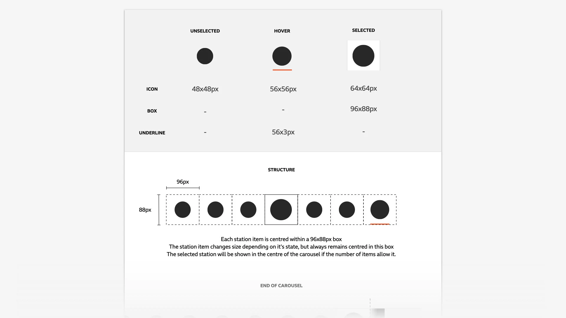
For the schedule page, I took stock of our Sounds components, patterns across the BBC that are in place already and the design language from the current schedules. This helped to shape the new layout. I also added a ‘station picker’ at the top of the page which would allow our users to move between schedules on a single page - a feature which had been requested by our audience.
I organised a UX design crit with the Sounds team. This was done through Miro, where I laid out the range of designs and gathered feedback. Following the crit, the designs were shared with the core team involved and product owner to gather any further feedback.
In the initial phase of this project we worked as a cross discipline team to define the parts of the designs we could ‘bank’. This enabled us to plan and ticket an initial build phase that wouldn’t be impacted by potential changes highlighted in user testing.
Once the designs were given the ok I moved on to research. For this I was responsible for working with our recruitment agency to find participants. I created a brief and worked with them to ensure we recruited participants who used the journey on web currently.
While the recruitment was ongoing I pulled together the discussion guide and a high fidelity prototype. For the prototype I used proto.io.
From the research we wanted to access:
Current schedules usage and behaviours
Usability of the new stations and schedules journey
Define the best metadata for the index page (Talent or Brand)
Test usability of the new schedule pattern itself
I facilitated the bulk of the sessions and also brought two other designers on board to help with the facilitation on the day. We conducted these sessions using video calls on user zoom.
Feedback on the new layout and journey was very positive. The main point of interest was the Talent vs Brand. Participants were positive about using a talent lead approach for the index page, however this heavily relied on their recognition of the talent. Therefore we decided to go with a brand led approach which provided instant recognition.
Following the research I pulled together a findings presentation which was shared with the full Sounds Design & Engineering team. This was used to feed into the stations and schedules work on other platforms and others projects which the insights applied to.
With the design tested I brought together final designs for handover. Working in a quad system meant that I held regular check-ins with the team, gaining constant feedback.
I worked closely with the lead engineer and our Business Analyst to bring the build tickets together and ensure all the details where present.
In terms of the wider team, throughout all phases of the project we work in Agile. UX are embedded as part of the development team, this means all updates are communicated at daily stand-ups and any issues are quickly raised and discussed. This ensures all team members have context on the project.
To partner the traditional Zeplin specs I included extra details docs which specified the behaviours of interactions, specific sizing and gifs to highlight the movement we wanted to introduce. These details docks were well received and gained a lot of positive feedback from the team. The docs aim to not only provide details for developers but highlight thinking and logic behind the designs, both now and anytime in the future that they’re needed.
Following this I oversaw build, conducting UX checks on the new components as they were built. During build I continued to take part in daily stand-ups and developer catch-ups to answer any question around the designs.
UX checks are conducted on our test environment. This allowed me to document any functional, usability or visual issues with the component. These were then discussed with developers, with small changes identified and addressed straight away and larger issues written up within their own ticket.
To wrap up, a final UX check was completed. This gave the chance to access the full journey and document any changes that need to be made before going live. This was partnered with a final accessibility check where the full team swarms and runs through the journey to make sure everything is as it should be and is ready for release.
Summary
This project is currently in build and I’m overseeing the final stages before release.
A core aim of the project was to not disable any users and negatively impact the current experience provided. From the usability testing we are confident that the new journey provides a familiar experience, matching current user behaviour and delivering a range of user benefits. These include; station switching on the schedule page, a single and more straightforward journey to schedules and finally additional relevant information throughout the journey to help find and decide what to listen to.
Working from the beginning of the project to not only define new components but a full journey was very rewarding. It gave me a chance to be very hands on with the engineers and through collaboration throughout the project, built a great relationship with the team.
Concept generation
Research
Self-Initiated work and teamwork
Workshop preparation and facilitation
Presenting and communicating research findings
Collaborating cross discipline
Developing team processes
UX design
UI design
Leading


